
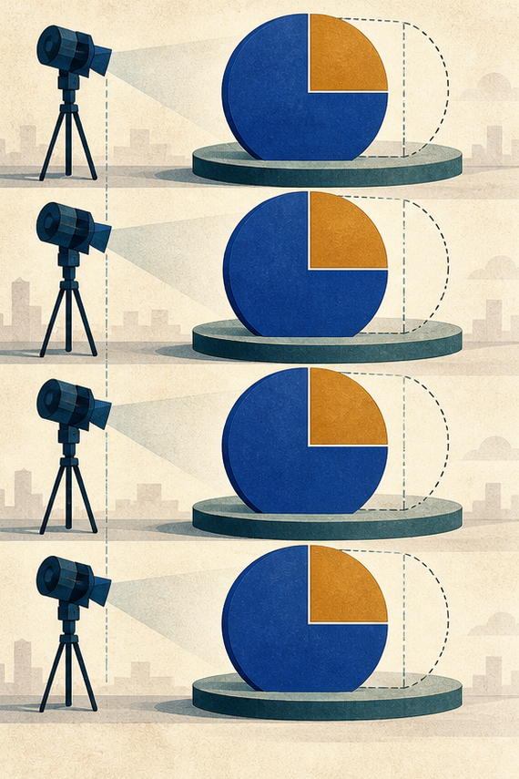
A percentage can change meaning while its digits stay the same. An animation shows a bright segment growing to 60 percent, but the denominator shifts from surveyed respondents to all eligible residents. Missing responses disappear from the picture, and motion gives the final number more certainty than the data supports.
Public-data animation needs a denominator lock. Before a chart moves, the team freezes who or what is counted, the period, geography, exclusions, missing-data treatment, and source version. Every frame must preserve that definition, not merely the headline value.
Write the Metric Definition before Drawing Frames
Record the numerator and denominator in words. “Sixty of one hundred completed surveys selected option A” is reviewable. “Sixty percent support” may hide nonresponse, sampling, weighting, or a different population. Keep the dataset identifier and extraction date with the definition.
Expose Exclusions and Missing Responses Visibly
List who is excluded and why. Mark unknown, refused, not applicable, and unavailable values separately when the source does. Do not distribute missing values across visible categories simply to make a chart fill its container.
Decide whether weighting or rounding affects the displayed total. A bar that sums to 99 or 101 percent may be accurate after rounding. Explain the difference rather than adjusting one category without evidence.
Keep suppressed small counts visible as suppressed, not zero. Suppression protects privacy and signals that the value exists but is not publishable. Animating the category away can change the apparent denominator and reveal which group was removed.
If the metric is a rate, record its unit and exposure base: per person, household, visit, kilometer, or another denominator. Similar-looking rates cannot share a scale when their bases differ. Write the unit on every state, not only the opening card.
Freeze Time Geography and Comparison Groups
Write the valid period, location boundary, and comparison basis. A city result cannot silently become regional, and a monthly count cannot become a year-over-year rate without a new definition. Use the same units and population across compared frames.
Record any boundary changes. A district merger, revised eligibility rule, or survey-method change can break a trend even when the label remains familiar. Introduce that break as a new series or annotation rather than smoothing it with motion.
Choose the comparison frame before designing the transition. Baseline, target, neighboring area, and prior period answer different questions. A visually convenient comparison is not necessarily the one the source supports.
|
Metric element |
Locked record |
Frame check |
|
Numerator |
Counted event or response |
Value maps to correct mark |
|
Denominator |
Eligible counted population |
Visible or stated |
|
Missing data |
Category and amount |
Never disappears |
|
Period and area |
Source boundaries |
Unchanged through sequence |
Animate the Change without Changing the Population
Storyboard the data states as static frames first. Each frame should carry the same denominator note, scale, units, and legend. If the population genuinely changes, stop the sequence and introduce the new definition rather than morphing between incomparable values.
Use Motion to Show One Relationship
Choose whether motion shows composition, sequence, difference, or flow. Do not make one transition perform all four. A composition animation can reveal segments of a fixed whole; a time sequence can move across dated snapshots with consistent definitions.
Avoid area and volume effects that exaggerate change. Expanding circles or three-dimensional bars can make a small numeric difference look large. Position and length on a fixed scale are easier to audit.
Keep animation duration independent of value when timing could imply magnitude. A category that takes twice as long to appear may seem twice as important. Use consistent pacing unless time itself is part of the encoded data.
Define what happens when a value is unavailable for one period. Hold a clearly marked gap instead of interpolating a smooth line. The absence is part of the data story and should survive the visual rhythm.
Generate Only the Non-Numeric Motion Layer
MakeShot.ai routes text or source images into video candidates through available models. An AI Video Generator can supply a restrained abstract movement or transition plate after the chart states are approved. Keep numbers, labels, legends, axes, and source notes as verified editable layers.
Do not ask MakeShot.ai to recreate a chart from a prompt. A plausible line or bar is not linked to the dataset. Use generation only where it cannot alter the count, population, or evidence status.
Save the motion plate, prompt, and approved chart states separately. If the plate changes timing or layout, rerun the frame audit before recombining live data.

Audit Every Frame against the Denominator Lock
Capture the beginning, each data change, the midpoint of every transition, and the settled state. For each capture, verify numerator, denominator, missing-data note, period, geography, scale, legend, and source. Mid-transition frames matter because viewers can pause or receive a thumbnail there.
Test the Full Sequence without Any Narration
Ask a reviewer to state what is counted, out of what, where, and when. If the reviewer can name the percentage but not its base, the animation has emphasized result over definition. Increase the denominator’s visibility or simplify the motion.
Then play narration without the image. Wording and visuals should describe the same population and uncertainty. A phrase such as “among respondents” cannot be dropped from speech while remaining only in small type.
Ask the reviewer to estimate the direction and rough size of change before showing exact labels. If visual impression and numeric difference disagree, reduce decorative motion or adjust the scale. The chart should not need narration to correct its own exaggeration.
Check color categories against the legend at every frame. A transition that blends red and green may create an intermediate category that does not exist. Use neutral transition states or keep marks discrete.
Inspect Crops Loops and Auto-Play Starts
A social crop can remove the denominator note. A loop can restart after the headline frame and detach the percentage from its setup. An auto-play start can begin in the middle. Export deliberate channel versions and make the metric definition recoverable from any entry point.
Review accessibility alternatives. Captions should provide the numerator, denominator, comparison, period, and direction of change. A reduced-motion or static version should communicate the same claim without animation.
Inspect thumbnails selected by the platform. A mid-transition frame may show an incomplete bar with a settled headline. Supply a deliberate poster frame where the data state and label belong together.
A second AI Video Generator candidate is useful only when a named transition problem remains. Do not let alternative motion styles reopen a locked statistical definition.
Publish the Animation with Its Data Map
Package the dataset snapshot, definition, exclusions, storyboard, live chart layers, MakeShot.ai candidate, frame audit, narration, and exports. Give the release a source version and correction owner.
MakeShot.ai can help the visual layer move, but the denominator lock keeps the public claim still enough to inspect. A successful animation lets viewers see change without losing who was counted, who was missing, and which comparison the motion actually supports.